Photo courtesy of Flickr/Tony Webster
In what neighborhoods are people getting murdered in St. Louis — and who's doing the killing? Nicholas Phillips' cover story in this week's Riverfront Times includes two different infographics that go a long way to answering those questions.
First, here's a map of all homicides in the city since 2008. You can click in for a bigger view.
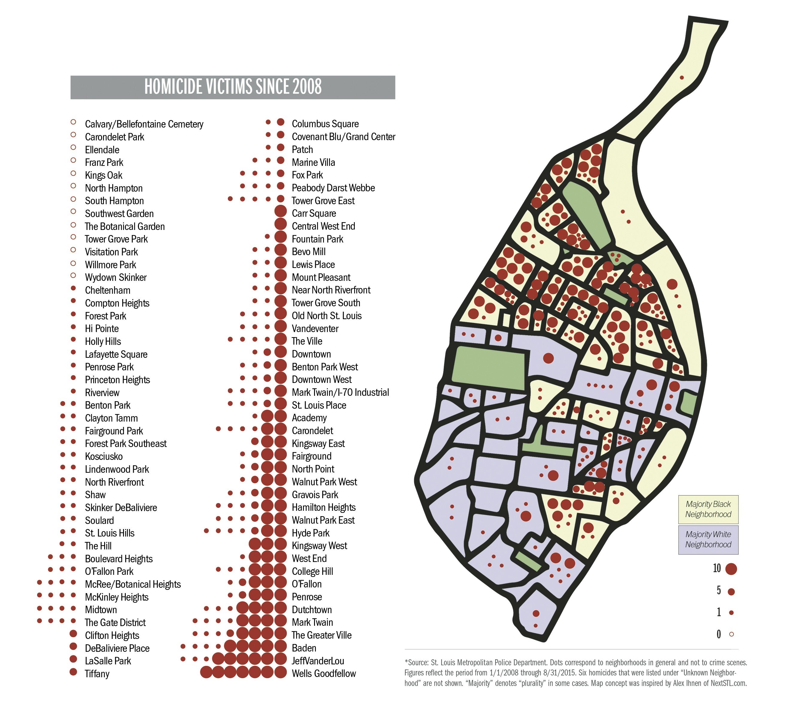
Each dot represents a homicide or group of homicides. Bigger dots are 10 homicides; midsize ones are five, and small ones are one. As you can see, while some north-city neighborhoods have gotten hammered, some south-city ones have had zero. As Phillips writes, the bulk of this year's homicides — 72 percent — have happened outside the downtown area and north of Highway 40.
Second, here's an infographic that shows the remarkable commonalities between the people being killed, and the people doing the killing.

As the story details, of the victims identified in St. Louis from January 2014 to the present, 90 percent were black, 85 percent were male and 48 percent were aged 25 and under.
Of the perpetrators charged with the crime in St. Louis during that same time frame, 95 percent were black, 91 percent were male and 55 percent were 25 and under.
For much, much more about homicide in St. Louis, please read this week's cover story.
We welcome tips and feedback. Email the author at [email protected]